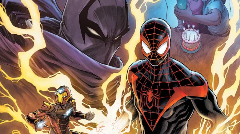
Javier Garrón Celebrates ‘Miles Morales: Spider-Man’ #10 with an Inside Look at the Issue
Garrón says that 250 issues after Miles made his debut, “the possibilities are endless.”
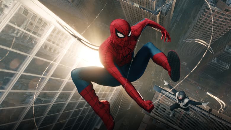
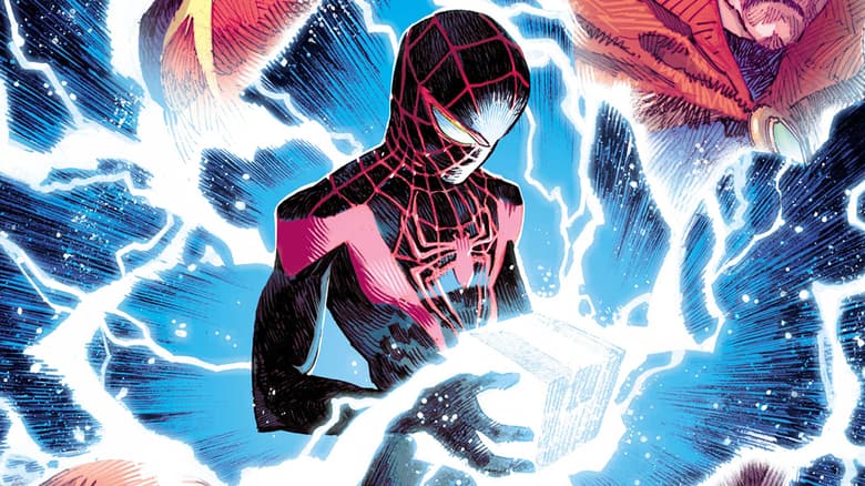
For the 250th issue and Miles Morales’ birthday, we’re celebrating by giving you a gift: A behind-the-scenes look inside the issue with Javier Garrón, one of Marvel’s Young Guns and the artist on MILES MORALES: SPIDER-MAN #10, which is on sale now.
Garrón and his Miles Morales collaborator Saladin Ahmed first started working together on MILES MORALES: SPIDER-MAN #1. Garrón recalled that they started with page one for the book’s announcement and afterward, they worked on character design. “Once we had all the homework done, we finally resumed the comic with page two. And as they say, the rest is history!” said Garrón.
In his own words, Garrón shared his thoughts on Miles’ journey so far:
“It's been exciting! There's a huge evolution in the character and the background world, and all the thrilling superhero action is richer than ever. Miles started as a frightened 13-year-old child, overwhelmed by the immense power and tremendous responsibility that comes with the hero mantle. Now Miles is a much more secure teen who has earned the right to be called Spider-Man. Still with insecurities and doubts, but never afraid and as courageous as ever. That's a character arc! And there's room for growth. The possibilities are endless.”
Garrón also shared his goals and motivations to bring this anniversary issue to life:
“I love an anniversary celebration in comics as much as anybody! I'm an artist as a profession but I'm a superfan at heart. I know what I love as a reader and I always have that in mind, to make my fan side happy. This issue needed to hit a lot of goals – the stakes both emotionally and dramatically are high. We're wrapping up an arc and setting things up for bigger stuff coming our way, and each of those levels of the character requires a different page layout, narrative, and visual language. So I had very clear in my head to make it all look cohesive despite the different situations and tones in the book. And make it all look as good as possible!”
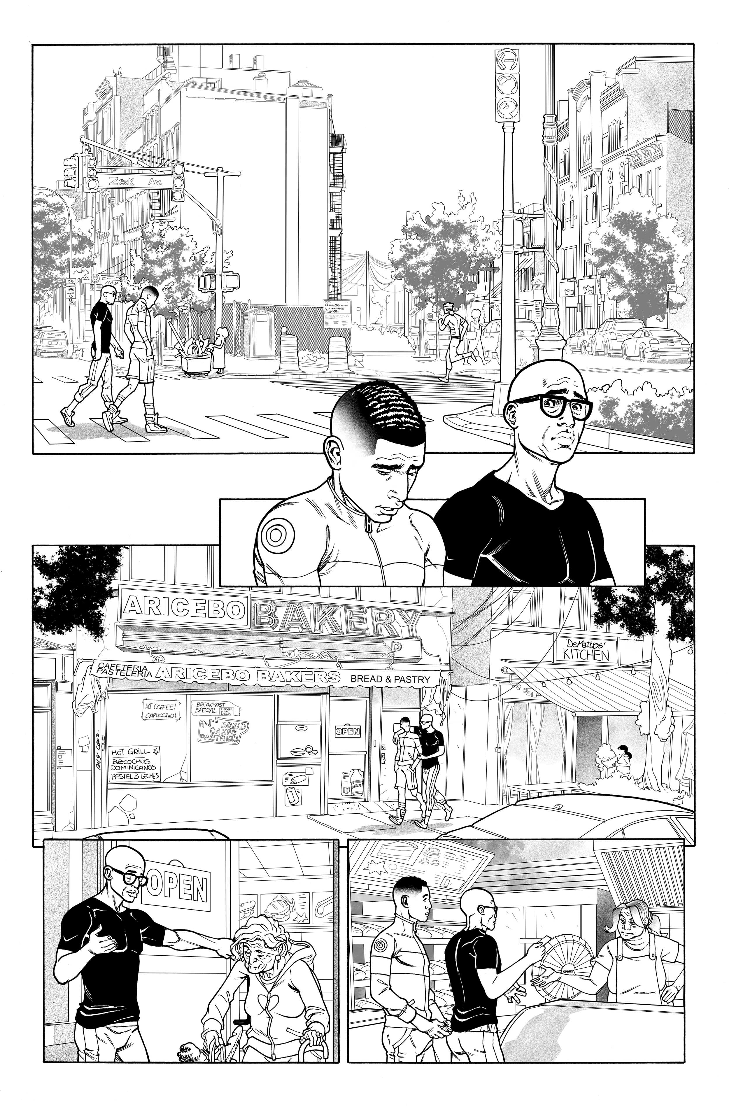
PAGE 4
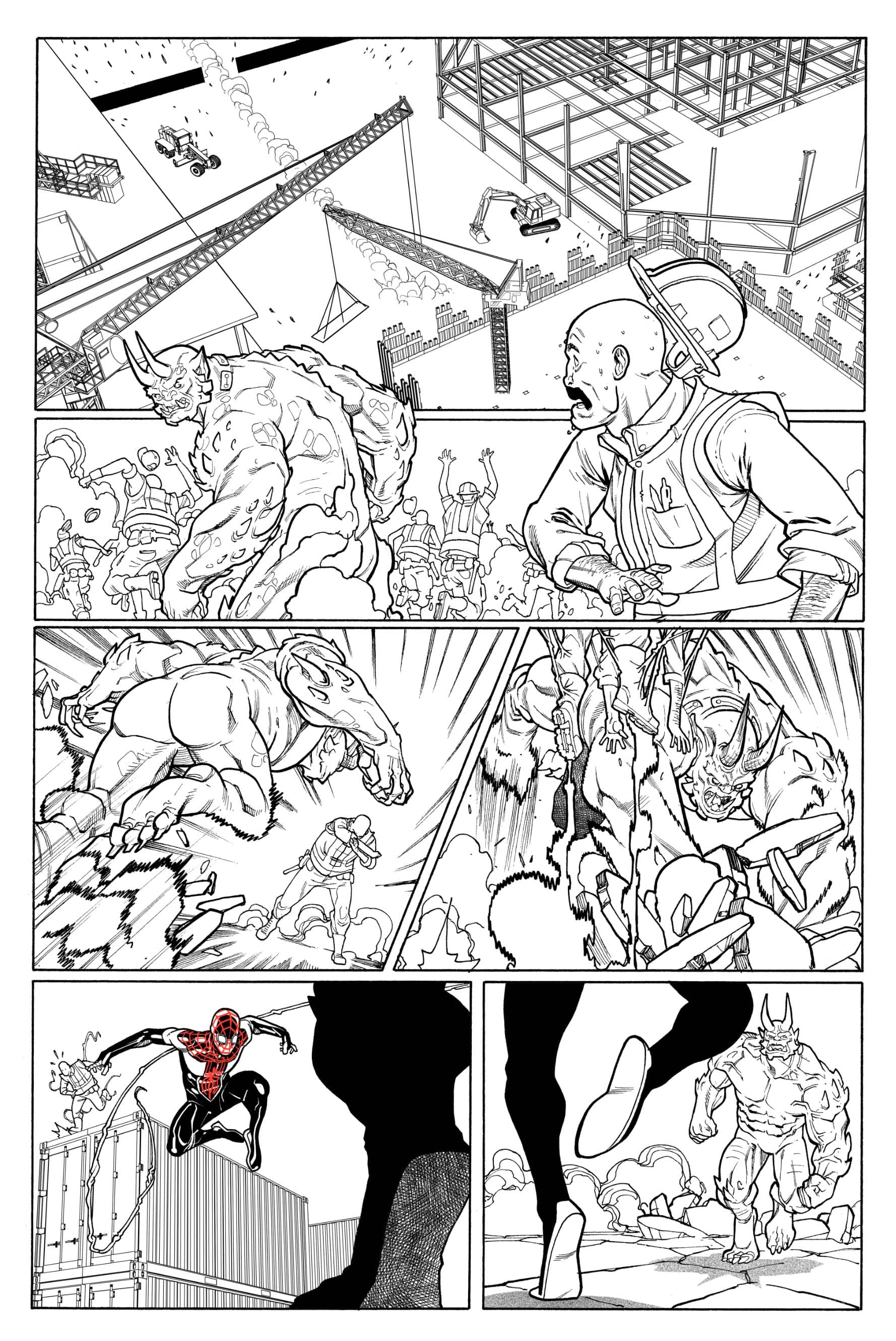
“One of the things I did when I started with Miles was to ground him in reality as much as possible. His clothes must feel believable for a teen his age and living in Brooklyn, and the street needed to feel like Brooklyn. But I'm Spanish! Born here and live here. I've been to New York several times (I try not to miss NYCC every year), but I definitely need help to make the streets feel real. So I use a lot of photo references – luckily we live in the internet era!
“I actually love drawing backgrounds. It’s hard work, requires a lot of energy, and an insane amount of time. But it totally pays off once it's finished. Pages look better! I love to get lost in background work.”
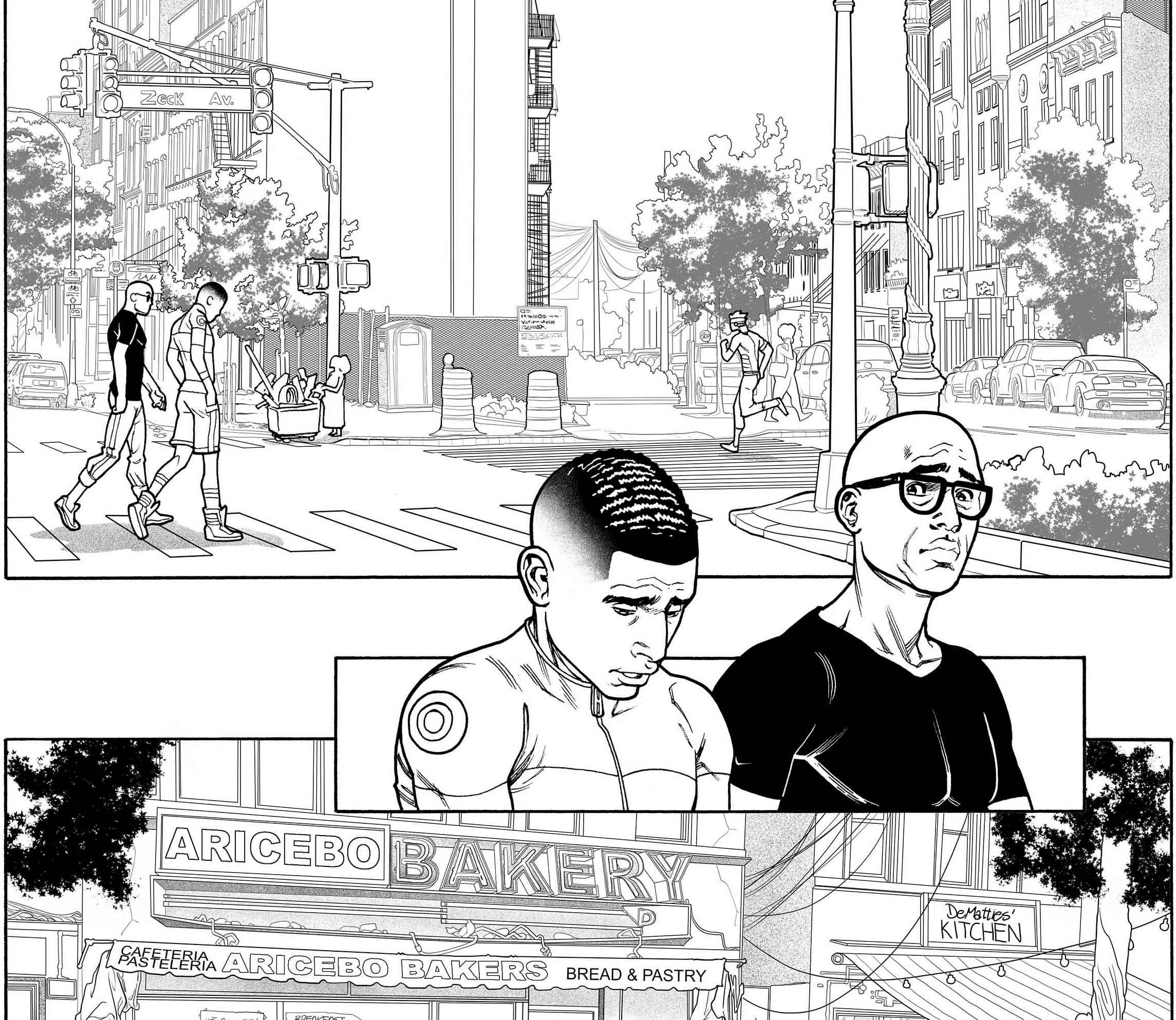
PAGE 4 CLOSE-UP
“I get very emotional when reading scripts! Only dialogue and voiceovers get to see the light of day in the final product, but scripts are filled with incredibly awesome descriptions and notes in order for the writer to communicate what he wants the artist to understand about the scene. I was extremely moved, and at the same time I felt the responsibility to translate all those motions into the art. I want readers to feel the same as I do, if not more, as Saladin and the characters do.
“Scenes like this don't need tricks or fireworks, no narrative stunts for me to show off. This was an important emotional moment and the key is always respect. I tried to convey all those emotions through their faces so that's what took all the hard work to achieve. Believable body language.”
PAGE 4 EASTER EGGS
“At the very beginning of my run in the title, I decided to pay homage to all the great Spider-Man writers and artists who have ever worked with the character, both Miles and Peter Parker. If I stand where I am it’s because of all those great names that came before. My work is built upon theirs. I owe them everything. So unless I'm terribly distracted, all the street names are Spidey creators!
“Here, in page 4, we have Zeck Avenue and the DeMatteis' Kitchen restaurant. As in the artist Mike Zeck and writer J. M. DeMatteis, the creative team behind SPIDER-MAN: KRAVEN’S LAST HUNT, my favorite Spider-Man storyline!”
PAGES 13-14
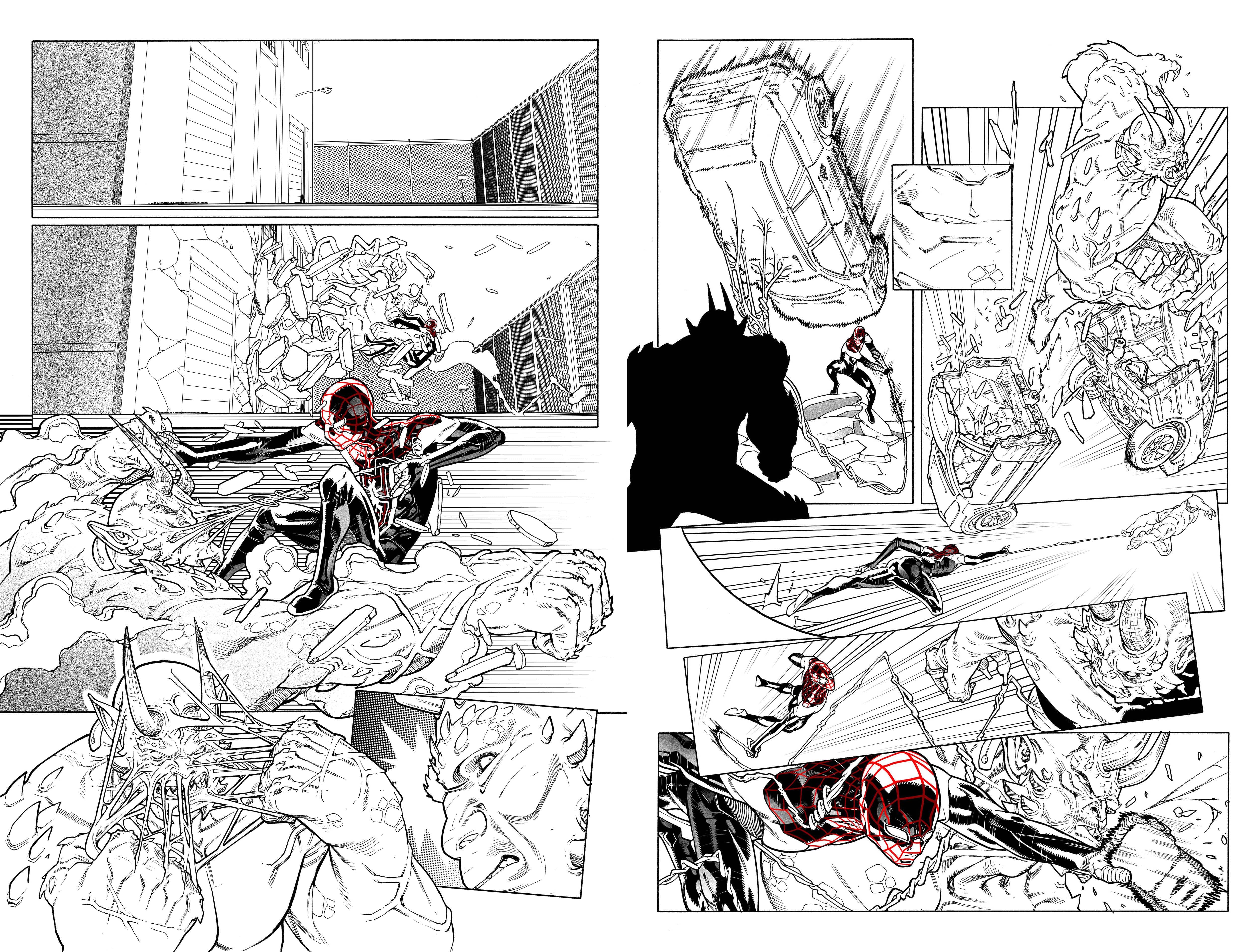
“I wanted to make Goblin look immensely menacing and incredibly difficult to defeat. To showcase all the Spidey little things we all love, like the postures, the web shooting, the venom blast, all that. In terms of narrative, I wanted to lay it out in a way that drove the eye faster and faster with each page with tilted and inset panels, lots of kinetics, forced camera angles.
“I also did not forget that while this is a one-on-one fight, which implies a lot of close-up work, they're fighting in the city to add to the scope that an epic battle like this has.”
PAGES 15-16
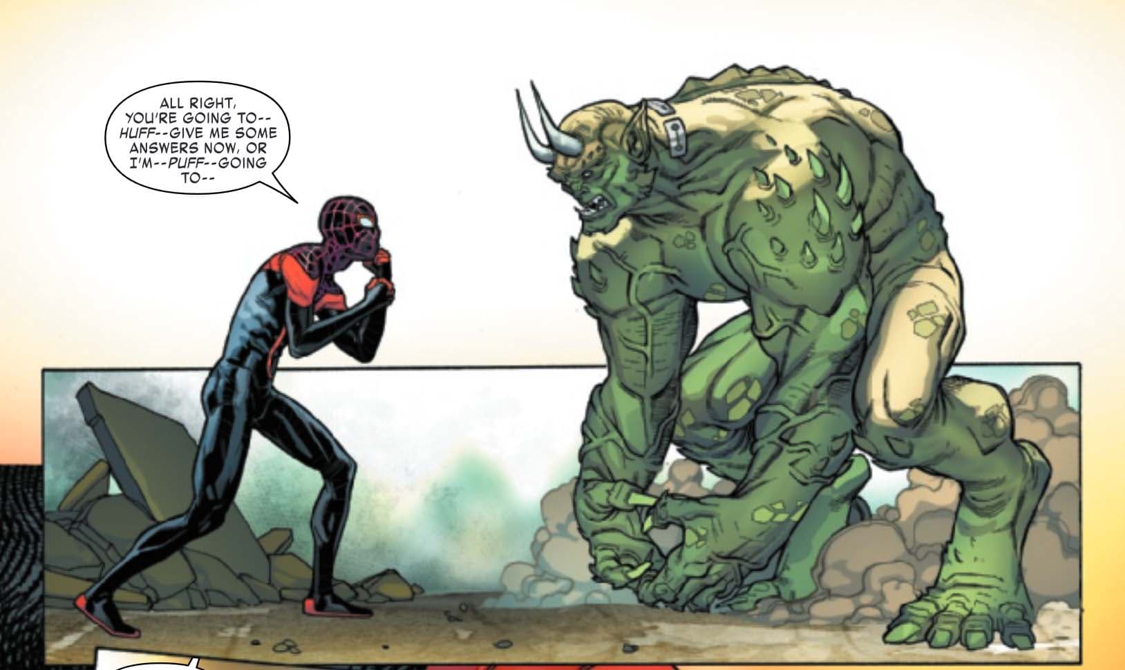
“Green Goblin is one the deadliest foes Miles has! He's an animal primal force, impossible to kill and insane. It's quite a deadly mix!”
“I loved to work in the physical aspect of the villain – he’s huge! And put side-by-side with Miles, you really appreciate how massive he is. There's a certain level of despair in the fight, and I wanted to convey it with the scale and volume Goblin has.”
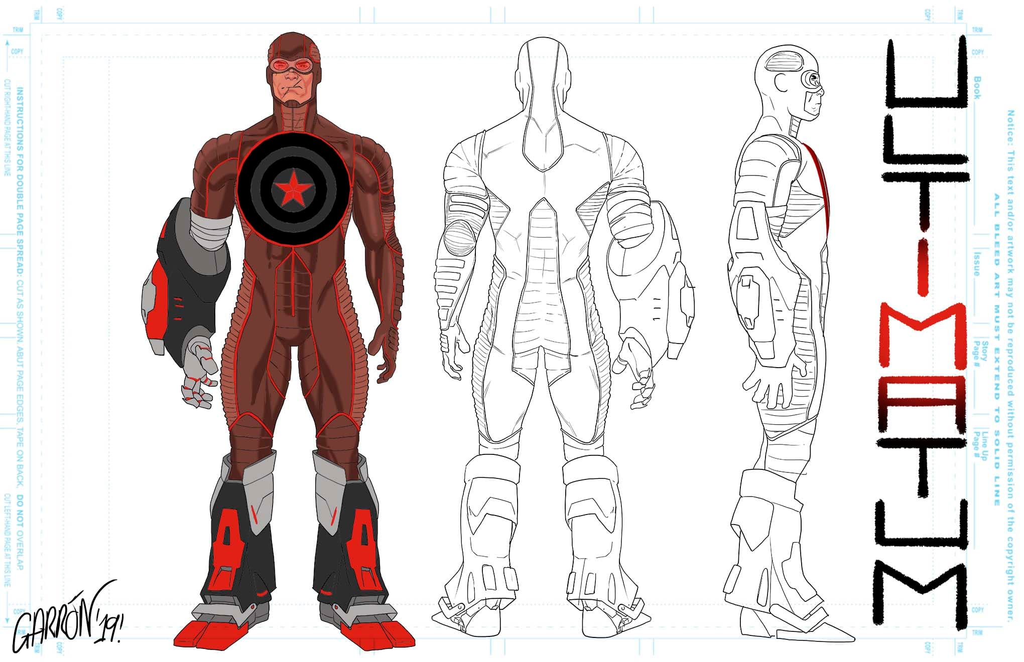
Ultimatum Character Design
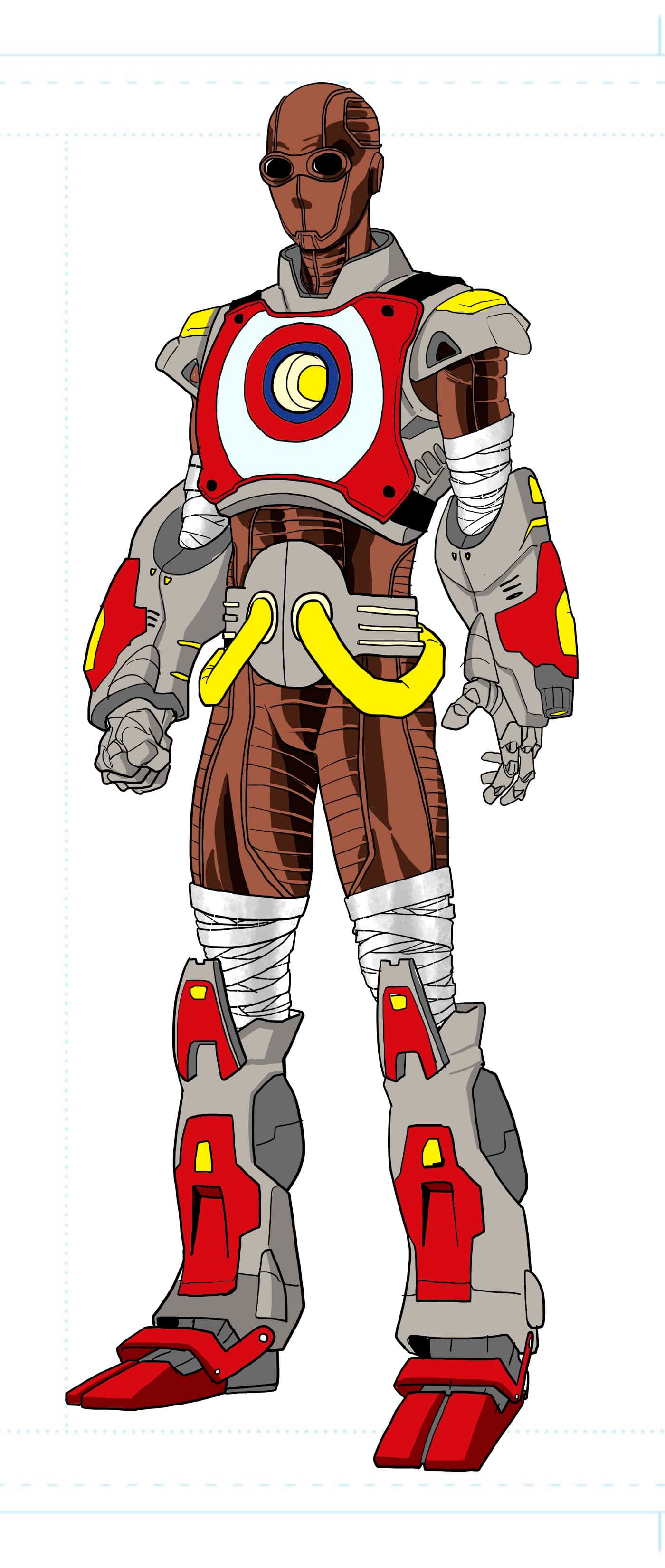
In this 250th anniversary issue for Miles Morales, he faces another villain – ULTIMATUM! But Ultimatum didn’t always look the way he turned out on the page. There were five approaches, with the fifth one being the final and approved version. Garrón shared the process from start to finish:
Ultimatum Character Design - Version 1
“We wanted to make an instantly recognizable banner of the Ultimate universe through all the different parts of the costume, but in the most cohesive way possible. It needed to feel like a costume where you could spot references [without it looking like] a patchwork thing. The main parts of the costume came from Ultimate Iron Man, Captain America, and Giant Man. At first I put maybe too much from all of them, even added more stuff in the mix, and it definitely didn't read well.
“And we wanted the Captain America shield to have a special importance. But a shield is, well, a big dish! It's hard to make it feel organically integrated in a costume. So in the first version it was fully integrated. Once it was done, I also didn't love the muscular volume of the figure. It needed to feel more menacing.”
Ultimatum Character Design - Versions 2 and 3
“Versions 2 and 3 incorporated a lot of notes and ideas we talked about. Less references and less items in the mix, volumes adjusted.”

“Also tried to incorporate the shield more literally. Version 3 was just having a little fun with color codes.”
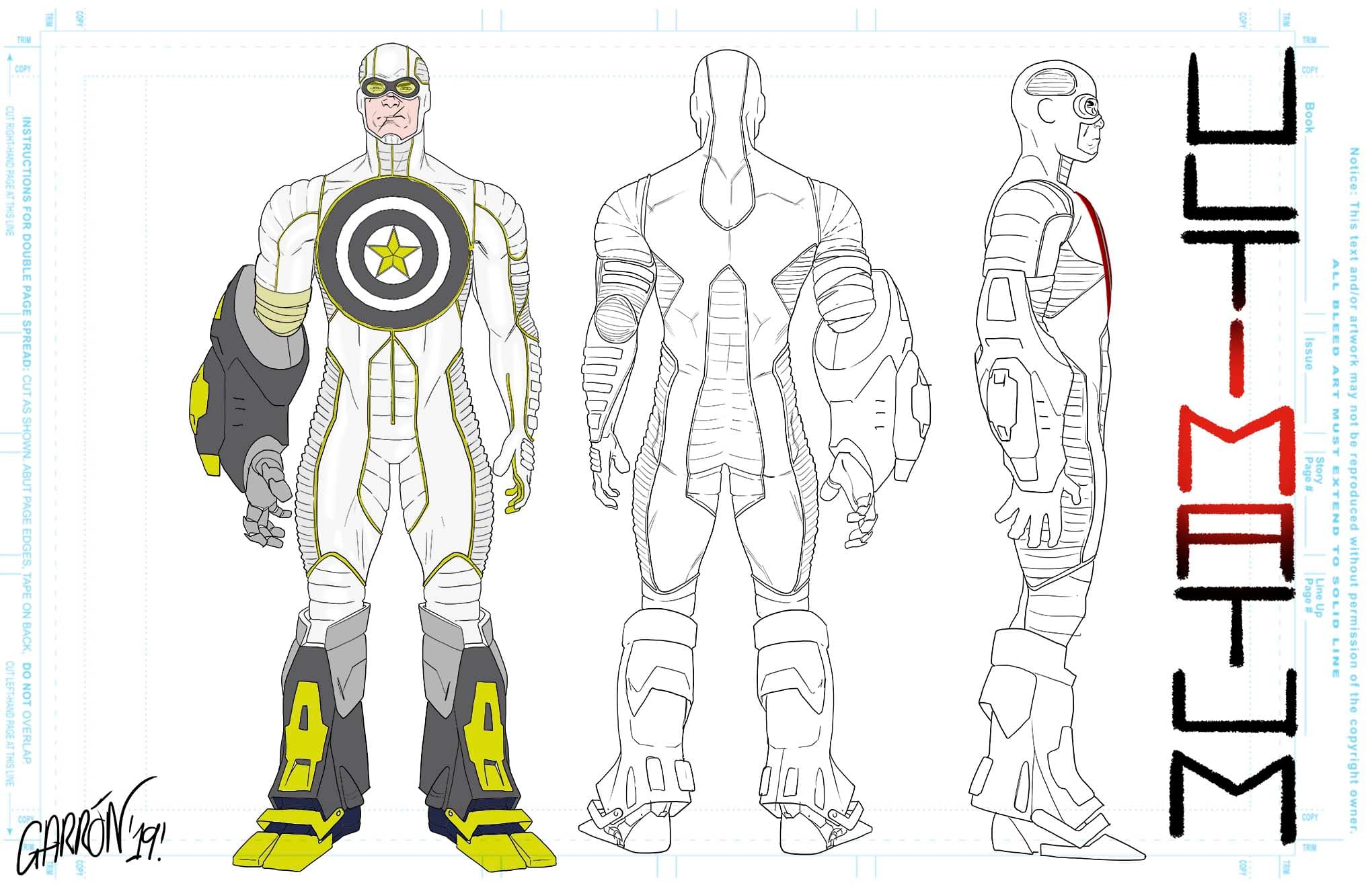
Ultimatum Character Design - Version 4
“Once we settled with a definite color theme and main elements, only the shield remained a work-in-progress subject.”
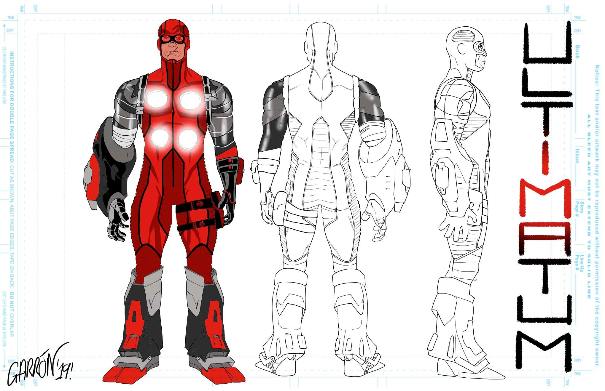
Ultimatum Character Design - Version 5
“I proposed to integrate it as a Winter Soldier type of arm, or just leave in the back but changing the color. And that last idea was the one that clicked. Sometimes less is more, and the more direct, simple, straightforward approach is the right one for a design. And the color theme is directly linked to Miles – it’s his reverse, even in that!”
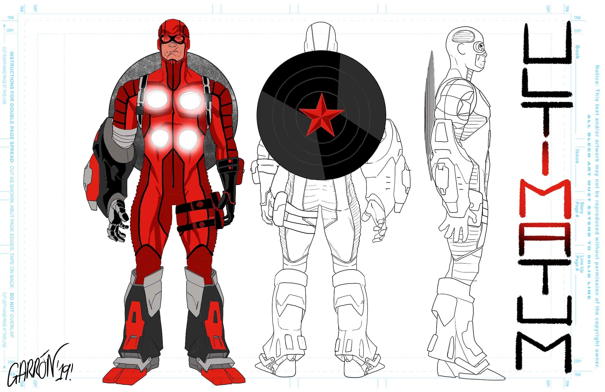
See the final version of Ultimatum and the next part of Miles Morales’ story in MILES MORALES: SPIDER-MAN #10!
MILES MORALES: SPIDER-MAN #10 is available now online and at your local comic shop!
Find out more about Marvel's Young Guns - The Next Generation of Elite Artists!
The Daily Bugle
Can’t-miss news and updates from across the Marvel Universe!
