Lethal Legion: An Avengers Sketchbook
Get your first look at the villains of No Surrender from Pepe Larraz!
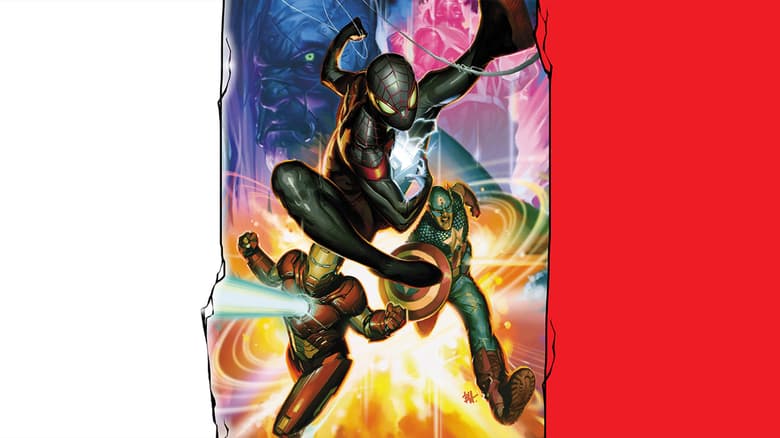
As the people of Earth come to realize that their home planet shifted to another part of the cosmos in the upcoming weekly event series “Avengers: No Surrender,” some will fight to keep everyone safe, while others will give in to their dark sides. Of the latter, you can easily count the all-new Lethal Legion. Made up of existing and new characters like the Blood Brothers, Metal Master, Captain Glory, Chall, Ferene, and Mentacle, this group of villains looks ready to live up to their death-dealing name.
We talked with artist Pepe Larraz—who helps kick off the story on January 10 with AVENGERS #675 along with writers Marl Waid, Jim Zub, and Al Ewing—about designing this batch of baddies.
Marvel.com: When it came to figuring out the designs of the Lethal Legion, was there an effort to give them a kind of team look?
Pepe Larraz: I was very excited for having the chance of designing a new roster of enemies for the Avengers. The idea of a team was there from the beginning. The issue was how to get it without being too obvious. I wanted for them to conserve their personalities on their respective looks, but at the same time add some common elements. The main common characteristic that came to my mind is that all of them are aliens, so I started looking for references of what “alien” should look like. I love this part, the inspirational search. I start digging on the internet in search of ideas, movies or video games, fashion—there’s some fantastic ideas there—contemporary and ancient art, elements from exotic cultures. I can have 40 tabs open on the internet browser at this part of the process.
The ideas take shape by two ways: either you know more or less what you want and you compose it by trial-error, or you discover what you are looking for by discarding what you don’t think works.
I wanted a dark look, but not as dark as the Black Order. Being as sinister as them would have melted the two teams visually, and going even darker wouldn’t fit for an all-ages book. I think Ferene and Chall were the most extreme we could go.
[Colorist] David Curiel and I based the colors on a scheme of black, red, and white, with golden details here and there. Actually, the colors are David’s, I only gave him a brief indication of what was on my mind.
Marvel.com: Metal Master first appeared way back in 1963’s INCREDIBLE HULK #6. He’s popped up a few times here and there, but what was it like re-designing a Steve Ditko character?
Pepe Larraz: Honestly, I hadn’t thought of it until now, because I didn’t want to add more pressure! Sometimes we have to work following the art of geniuses, and trying to be equal to them is impossible. So instead, I focused on the visual part. As he is so small, compared with the rest of the team, I wanted him to have a distinctive silhouette so he could be told apart on the wide panoramic shots, and the stripes helped with that.
Marvel.com: You also reworked the Blood Brothers for this squad. What went into designing their symmetrical looks?
Pepe Larraz: Their strength increases when they’re together so the idea of complementary uniforms was clear from the beginning. Then I played a bit with the stripes and black parts until I found a design I liked. In some of those designs, I added facial war paint because I love those tribal elements on the alien designs.
Marvel.com: Captain Glory appears to have some Kree or Captain Marvel influence in his costume. Can you talk a bit about that?
Pepe Larraz: I couldn’t find too much reference to him on the net, and the description I got was quite brief, something like a “Kree Captain America,” but an evil version. I really can’t take much credit for this design because almost all the elements were previously designed, and the designs were amazing, like the helmet. It was more a collage than an actual design from point zero. I like to keep the design as minimal as I can, base it more on the silhouette. I really like this one.
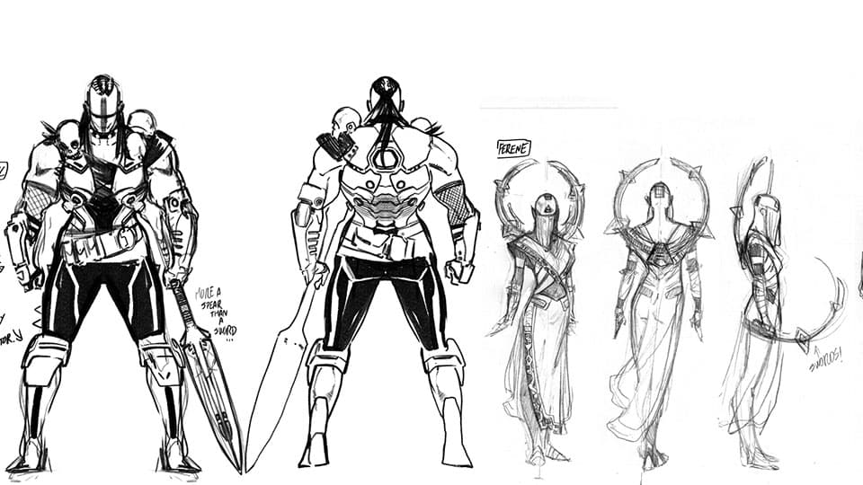
Marvel.com: Along similar lines, can you explain what went into the design of Mentacle, Chall and Ferene?
Pepe Larraz: Those are the designs on which I spent more time. As those characters are completely new, all of the uniforms are my doing.
On Mentacle, whose name I love by the way, the description included some complicated metal tentacles, but since I knew the pages would be cramped with characters and details, I made [these] black-goo-ectoplasm tentacles instead to save time and give black areas to the design, in order to be eye-catching on the page. At the beginning, I suggested removing her arms, but at the end, we left them to give her a more human like form.
For Ferene, I wanted her to be enigmatic, dangerous; coming from a part of the universe you don’t want to visit. It is like Samurai [meeting] “Hellraiser.” I wanted the design to look sharp, cold, always ready to attack, as if she could cut you if you touch her. As a fun fact, the round metal form on her back looks like a saint’s aureole, because I loved that religious touch, but it was also was intended to be a pair of curved swords.
For Chall I went nuts. I looked a lot of post apocalyptic fashion costumes—yes it exists!—and took some elements like the cross painted on her face. She is like the Mad Max version of Brienne of Tarth, a savage hunter of all kinds of living beings, so I added the skulls on her shoulders as trophies, and I based her sword’s shape on an ancient Polynesian spear. The metal parts on her costume are symmetrical; the organic are not. I think she looks deadly.
AVENGERS #675 by Mark Waid, Al Ewing, Jim Zub and Pepe Larraz debuts on January 10, kicking off “No Surrender”!
The Daily Bugle
Can’t-miss news and updates from across the Marvel Universe!