Jordie Bellaire: Vision Visionary
The colorist recounts the creation of the Avenging Android’s particular palette!
The beauty of Tom King, Gabriel Hernandez Walta and Jordie Bellaire’s VISION continues to inspire and impress. Though the series launched about two years ago, the six-issue VISION DIRECTOR’S CUT limited series will remind existing readers of that goodness while also bringing in new fans. Each DIRECTOR’S CUT issue features two of the original books, plus plenty of in-depth, behind-the-scenes info.
Last month we talked with Walta about bringing the story to life and now we’re chatting up Bellaire about building a color scheme that not only went a bold new direction, but also made reference to the past while taking intriguing twists and turns, especially during flashbacks.
Marvel.com: Classic Vision has this bright, bold color scheme. I want to say that the version in VISION is more muted and deep, but am not sure if that’s the right terminology! How would you compare the two palettes?
Jordie Bellaire: I think Vision’s newest look is dictated mostly by Gabriel Walta’s beautiful use of washes combined with new creative technology for more understated and subtle coloring in programs like Photoshop. As a team, we weren’t forced into using what was available to us at the time of classic Vision which was only bright, selective colors. We could go there if we wanted to, like the flashbacks, but we were allowed the freedom to tell a story with a range of color and techniques.
Marvel.com: Did it take a while to nail down this new color scheme during the design process?
Jordie Bellaire: Not really; I think having already worked with Gabriel Walta on great books like MAGNETO we were prepared for what it was like together as a team. We think a lot alike. We both take great inspiration from films, for instance the Coen Brothers have come up a few times in the past few years that we’ve worked together because of their excellent use in simplicity of composition and color design.
Tom King was also just a dream to work with and is extremely hands off in the coloring process. He allows me to be as loud or restrained as I’d like, trusting that I’m working in service of his story and the art—which I’d like to think I am and did!
Marvel.com: From a color and texture perspective, this book feels very different from most super hero books. Where does that come from?
Jordie Bellaire: Again, I think this is really dictated by the genius that is Gabriel Walta. He is incredibly unique. I congratulate Marvel for hiring him on high-profile books that, 35 years ago, he maybe would haven’t had the opportunity to do. His art is what makes this book such a success, combined again with Tom’s impeccable storytelling. It makes it fairly easy to get in and do my job since I respect the two as artists so much. Creatively, everything was brought to the table and we all sat at that table, taking on each other’s strengths and leveling them up each issue.
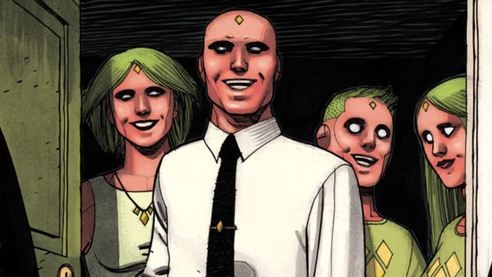
Marvel.com: You went with more themed colors during the flashbacks of Agatha Harkness, Victor, and Virginia. How was it figuring out those visual dynamics?
Jordie Bellaire: These flashbacks were some of my favorite things to do. Agatha, the story of a ghost that finds the future in blood, Virginia and the others Visions have flashbacks that echo to their iconic skin color and yellow energy—like the memory of a droid, mechanical and scratchy. And lastly, Victor, half human and half droid, the yellow is peppered throughout a world of blue, he’s in the center somewhere between Agatha and the Visions. These sorts of things aren’t planned incredibly well in advance but I do like to think on them as I see the art and digest the story. Thankfully, Tom wove such a well-told story that it all comes together and color pushes the themes home even further still.
Marvel.com: What do you think it was about this book that resonated so much with so many people?
Jordie Bellaire: This book is a tragedy. It’s a book about normalcy and the tragedy that is normalcy and the desire to belong. I think this resonates with many people as I think many of us secretly feel this way. The need to fit in, to be loved, to be respected but to be yourself and be true to that self. It’s an extremely deep and heavy work that in the current climate of super hero books, really stepped into the emotional darkness many didn’t quite expect. It deals so much with the human condition and what is a human condition, stories like that will live on forever and continuously be told as we’re fascinated about truly connecting to each other and to ourselves.
VISION DIRECTOR’S CUT #1 by Tom King, Gabriel Hernandez Walta and Jordie Bellaire phases in on June 14 with the second issue following on July 12.
The Daily Bugle
Can’t-miss news and updates from across the Marvel Universe!