Pepe Larraz on How He Created an All-New World in ‘House of X’ #1
Go inside one of the summer’s hottest comics with superstar artist Pepe Larraz!
If you’ve been reading Marvel Comics for the past few years, it should be no surprise that Pepe Larraz is one of the rising stars in the industry with his breathtaking runs on UNCANNY AVENGERS, EXTERMINATION, and AVENGERS: NO SURRENDER. Now, Larraz is teaming up with writer Jonathan Hickman on HOUSE OF X, one half of the highly anticipated X-Men event that started this summer.
Marvel.com recently invited Larraz to share his commentary on HOUSE OF X #1, which we present to you below in his own words. Take it away, Pepe!
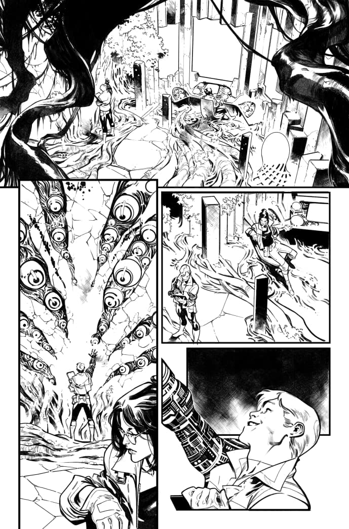
HOUSE OF X #1 is, in essence, a world-building issue. It establishes the new status quo for the relationship between humans and mutants, as well as the new gap between them. Since comics are a visual medium, it also had to visually establish that difference. The idea of a Krakoa-based civilization was in the very beginning of the story. And making all mutantkind-related elements based on organic, natural shapes was one of the best ideas Jonathan had. It makes the mutant world so distinct and so different from the human society that the gulf between them seems irreconcilable.
For me, that idea was both inspirational and challenging. I had to design a lot of new environments for a world made of vegetation and flora. But if you design a regular building and then you add vegetation over it, it doesn't look organic, it looks abandoned. So the environments should be something different from human architecture. Then I started learning about biomimicry, and that changed the direction of my designs for the book. Biomimicry is the science and art of emulating nature’s best biological ideas to solve human (mutant?) problems. Biomimicry in architecture and manufacturing is the practice of designing buildings and products that simulate or co-opt processes that already occur in nature.
I like to do what I call an inspirational search when I start a new project. The ideas that came from the biomimicry search were fascinating. The biomimicry architecture was as alien as I needed it to be. But at the same time, it was humanly relatable. The whole environment had to work as a living organism because it's part of Krakoa. So, no more walls or doors, no more windows or furniture.
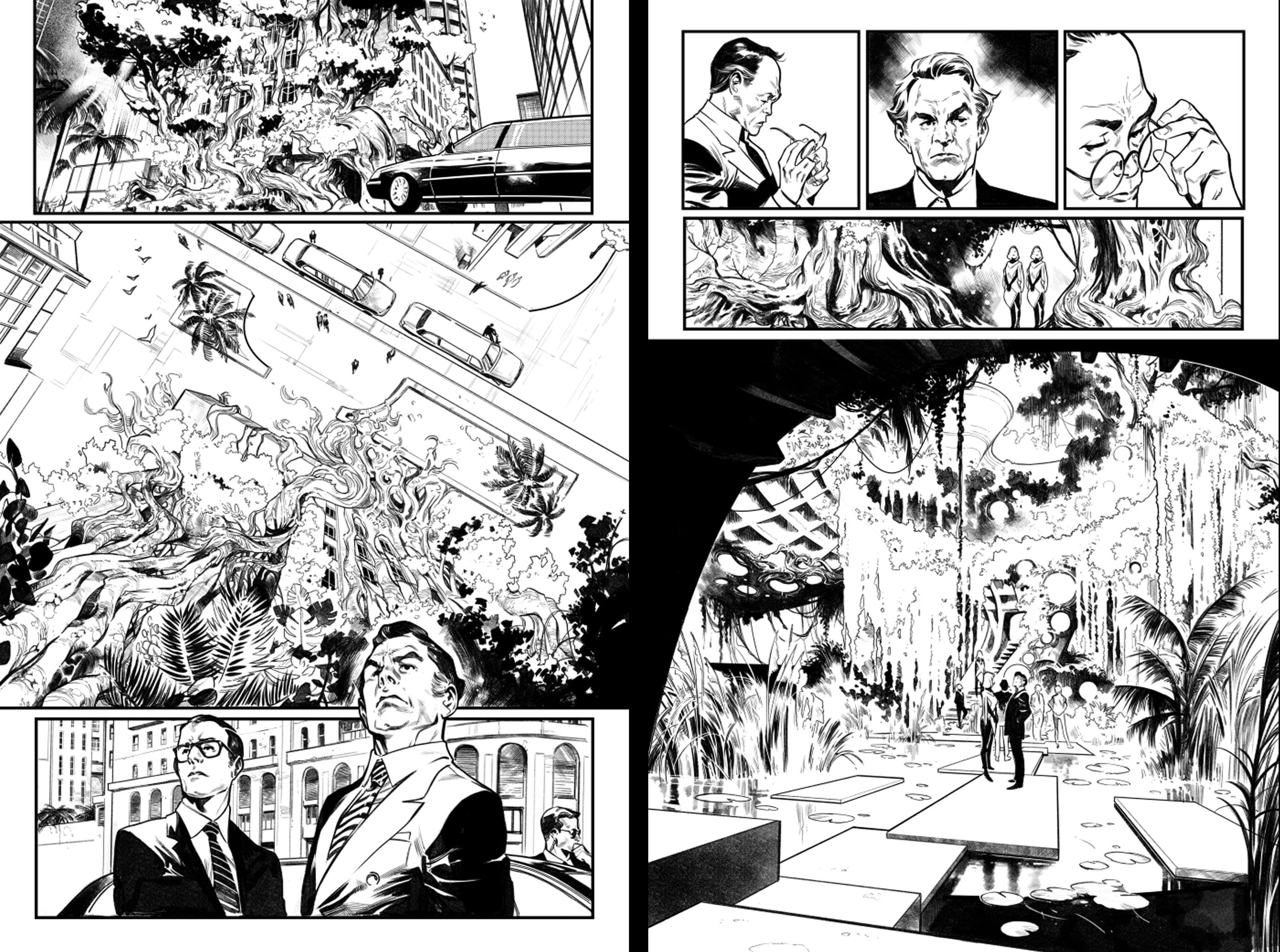
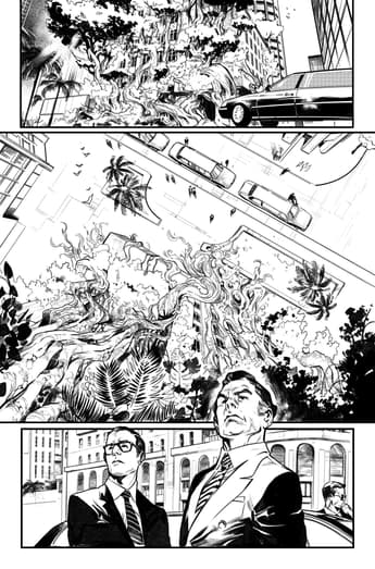
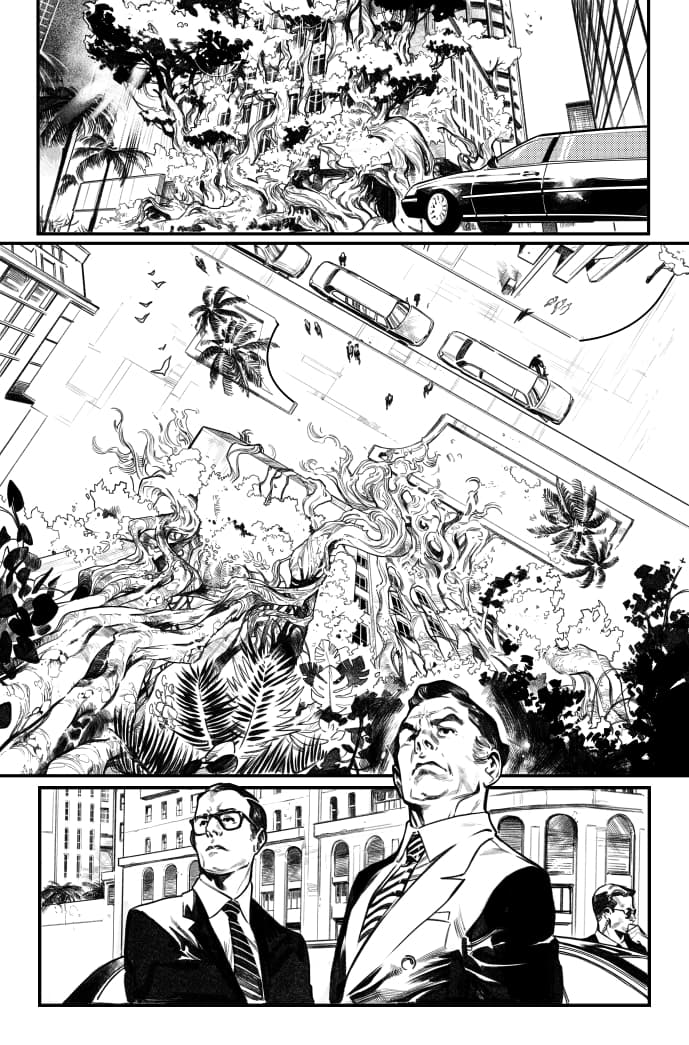
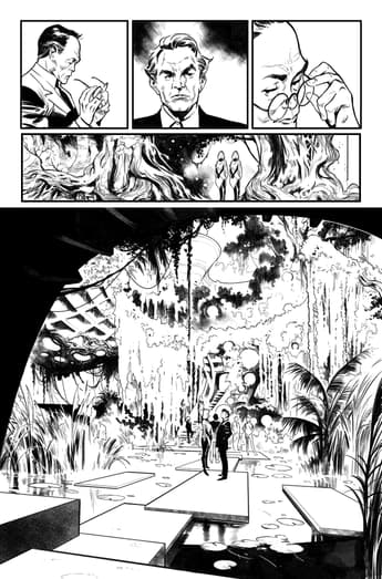
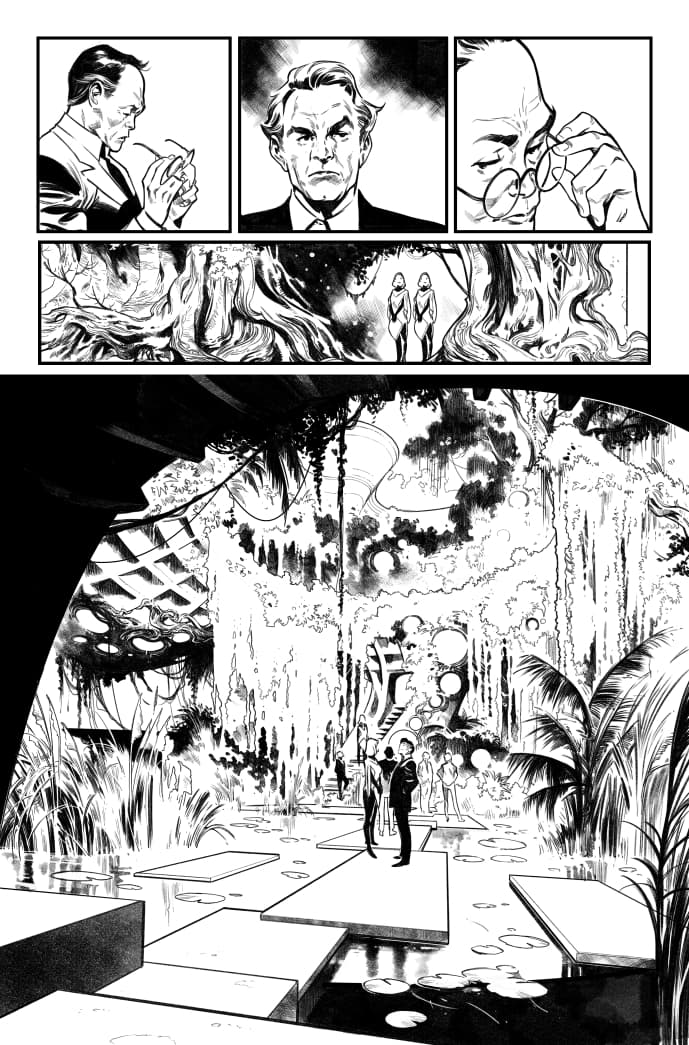
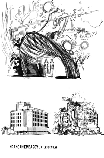
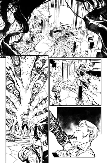
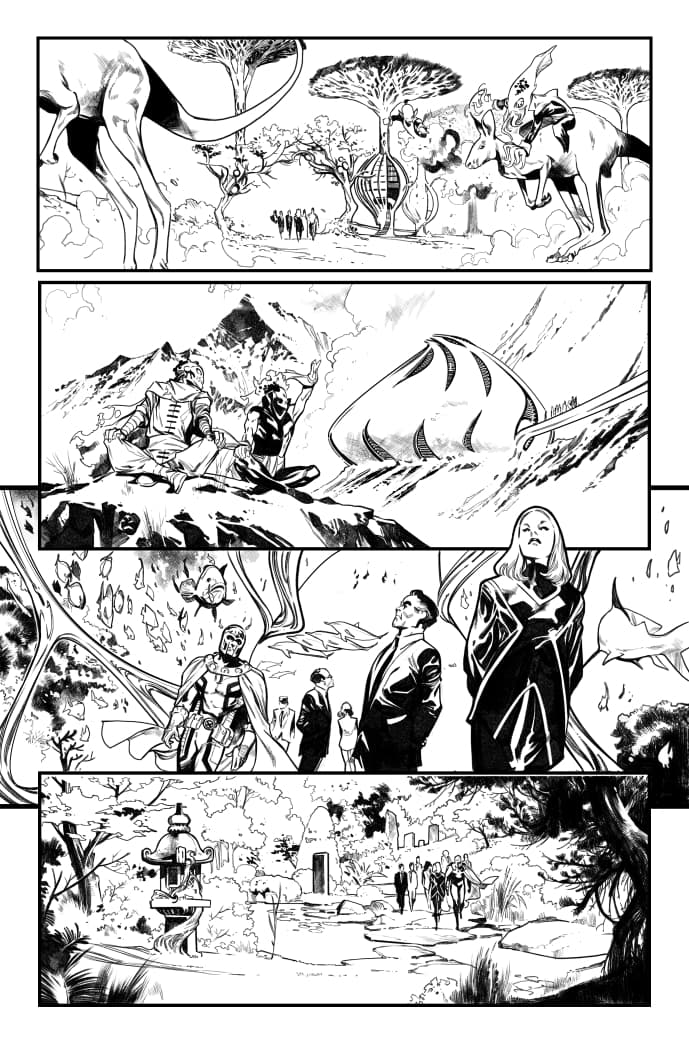
A clear example of this is the embassy scene. The exterior part of the embassy is just a regular building covered by vines and vegetation. The idea is that the building should look messy, invasive, and a bit scary. Something the ambassadors could look upon in awe, but with disgust at the same time. This was intentional, when the ambassadors crossed the threshold, they discovered that this was another game entirely. The interior of the embassy is an architectural space formed by a waterfall, vines, reeds, and rocks. It’s almost a natural environment, if it wasn't for the stairs. There's no trace of human architecture there – and that was the point. This is uncharted territory, folks.
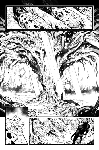
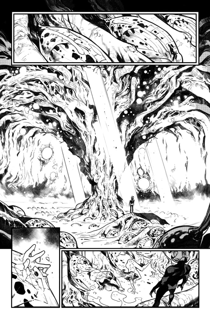
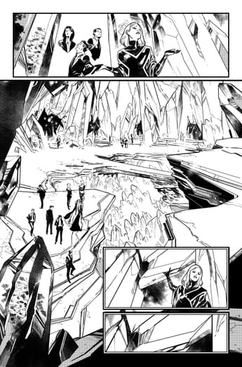
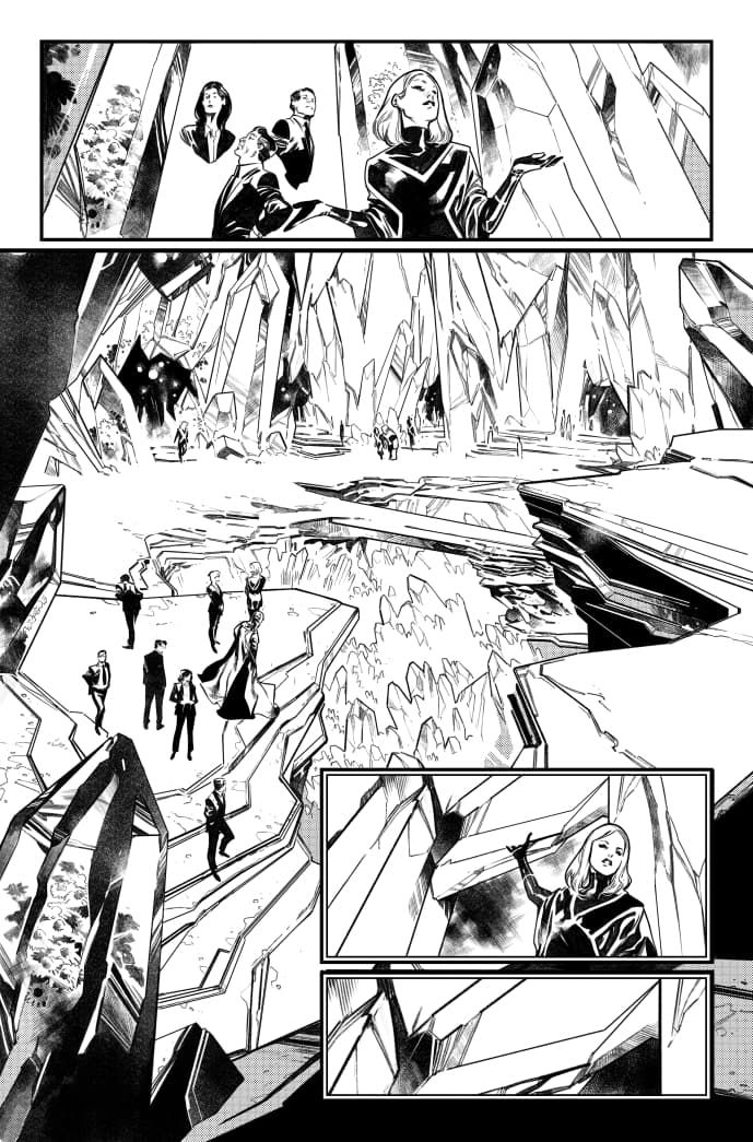
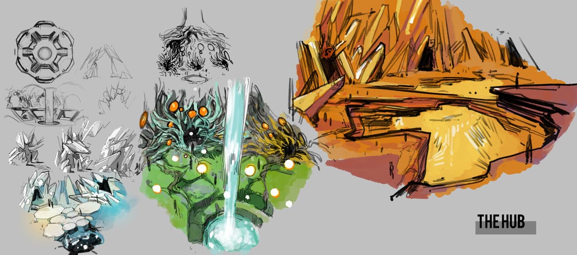
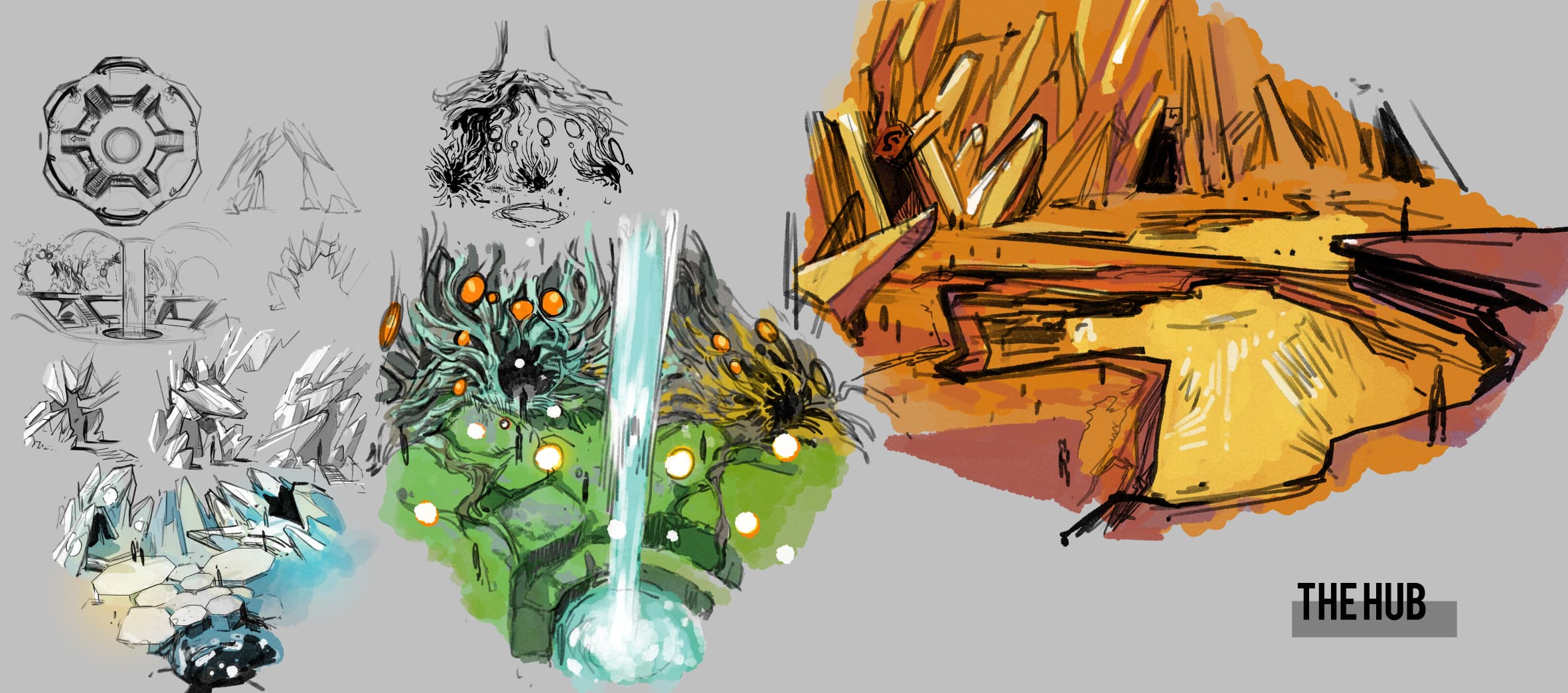
As I had to design more places of this new world, I didn’t want to turn all of the designs into a combination of the same natural elements, vines and leaves. That’s because every place had to be recognizable and distinct. So I used crystals for the Hub on page 21, basalt rocks for the control room on page 10, mangrove roots for the first scene of the book on page 1, wasp cocoons for the husks of that same scene, organic shapes mixed with treehouses and contemporary architecture on page 23. In the upcoming issues, you'll discover Krakoa's other environments, with other natural features. I really hope you like them as much as I did.
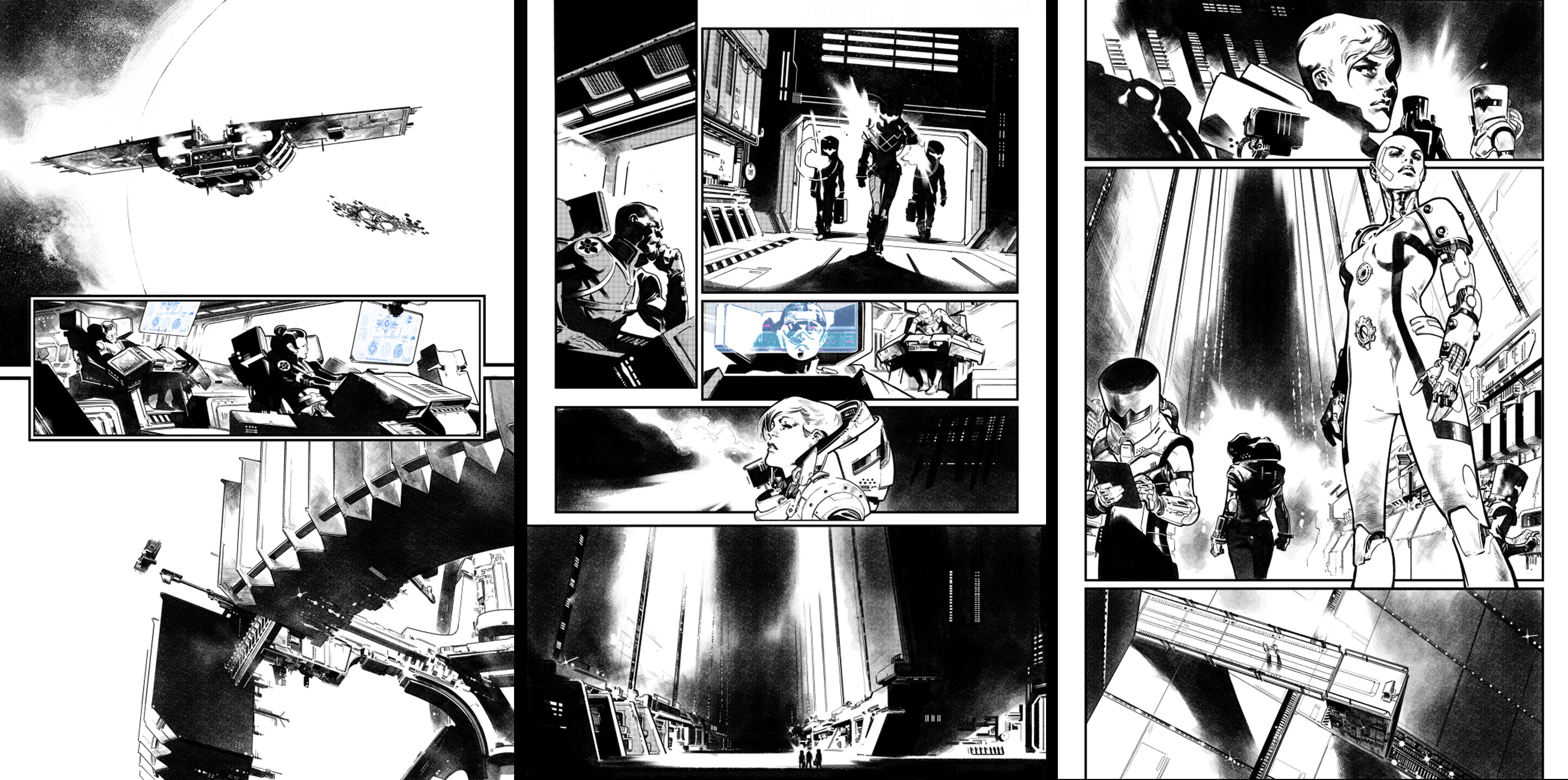
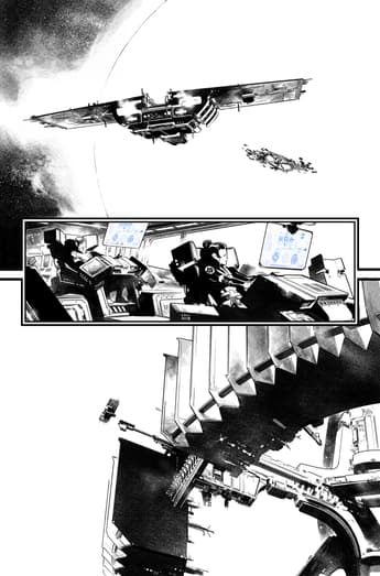
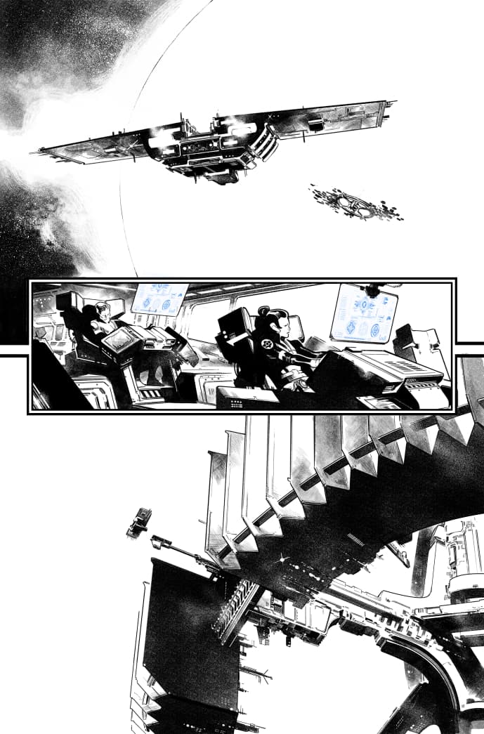
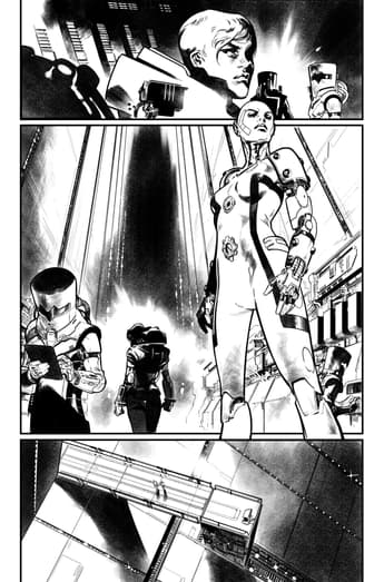
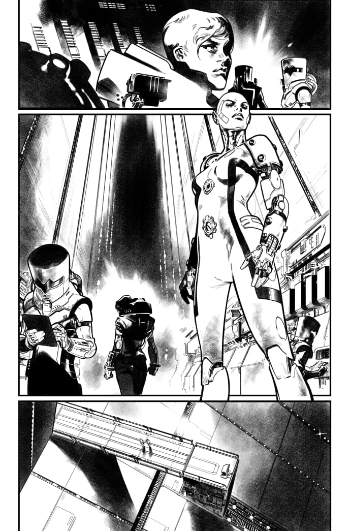
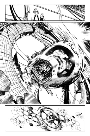
On the other hand, we had the human world. I wanted to make the spaceship scene as industrial as I could. Huge, silent, menacing. This helped to visually convey the idea of two different factions confronting each other. For the scene of the Mother Mold on page 17, I did several versions of the page on which we see the head.
I had a problem with scale. When you draw something so big (especially something we had never seen before), a common trick is to use a human figure in the foreground to add scale. My first layouts went that way, a huge room (quite like the enormous Death Star's core from Star Wars) with the head inside it. But then Jonathan sent me a schematic of his idea of the station, and the head was in the open, hovering over the Sun. I had to redraw the whole page, and used the huge windows of the inner ring of the station to add the scale.
For the suits of the characters, a lot of suits were provided by Jonathan and editors Jordan D. White and Annalise Bissa, but some of the new designs, like the AIM/Orchis spacesuits on page 14, I had to do them almost directly over the page. This happened more than I liked during the book; there are a lot of designs done on the pencils stage. That is because of the amount of things to design in every issue and the time we had for that.
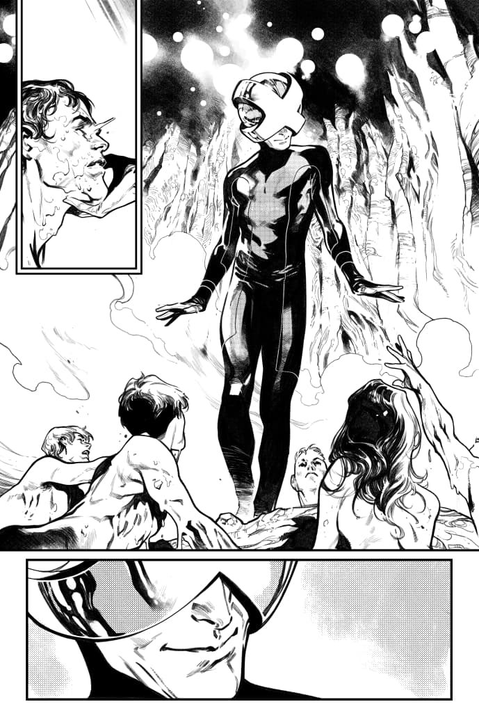
At this point I need to confess another thing: I don’t think I've ever drawn Charles Xavier's helmet the same way twice. The design is a mix of R. B. Silva’s and Jonathan's ideas, I added something at some point, but the credit is due to both of them. So you can laugh, 130 pages of HOUSE OF X and I've never been able to do exactly the same helmet. I knew this would happen and suggested [we] make a 3D model of the definitive design. But at the end, we had no time for it. This is something that happens to me a lot with character’s suits, even with the ones I design myself.
To see more of Larraz’s stunning work, check out the gallery below -- then pick up HOUSE OF X #3 on Wednesday, August 28 online or at your local comic shop!
The Daily Bugle
Can’t-miss news and updates from across the Marvel Universe!
