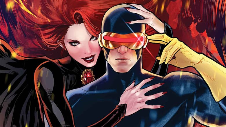
Marvel Celebrates Letterer Appreciation Day 2022
To celebrate Letterer Appreciation Day, learn a little more about the subtle art of lettering and meet a few of our mighty letterers.
September 1 marks Letterer Appreciation Day, and Marvel is celebrating all month long to honor all the hardworking letterers who make our books possible. To kick off these festivities, let's pull back the curtain on what lettering is, why it's so important, and some tips and tricks of the trade.
WHAT IS LETTERING?
According to prolific letterer and Virtual Calligraphy (VC) studio head Chris Eliopoulos, "Letterers are the inkers for the writers." In other words, letterers are the graphic artists who take the writer's words and add them to the artwork, but their job extends beyond the simple transfer from script to the published page. Letterers also control pacing, convey emphasis, create sound effects, distinguish spoken words from thoughts, and so much more.
Lettering is a tightrope act. A letterer's work shouldn't go totally unnoticed, but it shouldn't overpower the artwork, either. The letterer's job, then, is to mesh seamlessly with the artwork. As Eliopoulos explains in his essay for Marvel by Design, this leads the letterer to use a handful of skills – including graphic design, calligraphy, storytelling, and computer literacy – to provide a holistic experience for the reader. After all, a good letterer knows when to stay soft and simple and when to go big and bold. "The Quiet Art of Lettering," indeed!
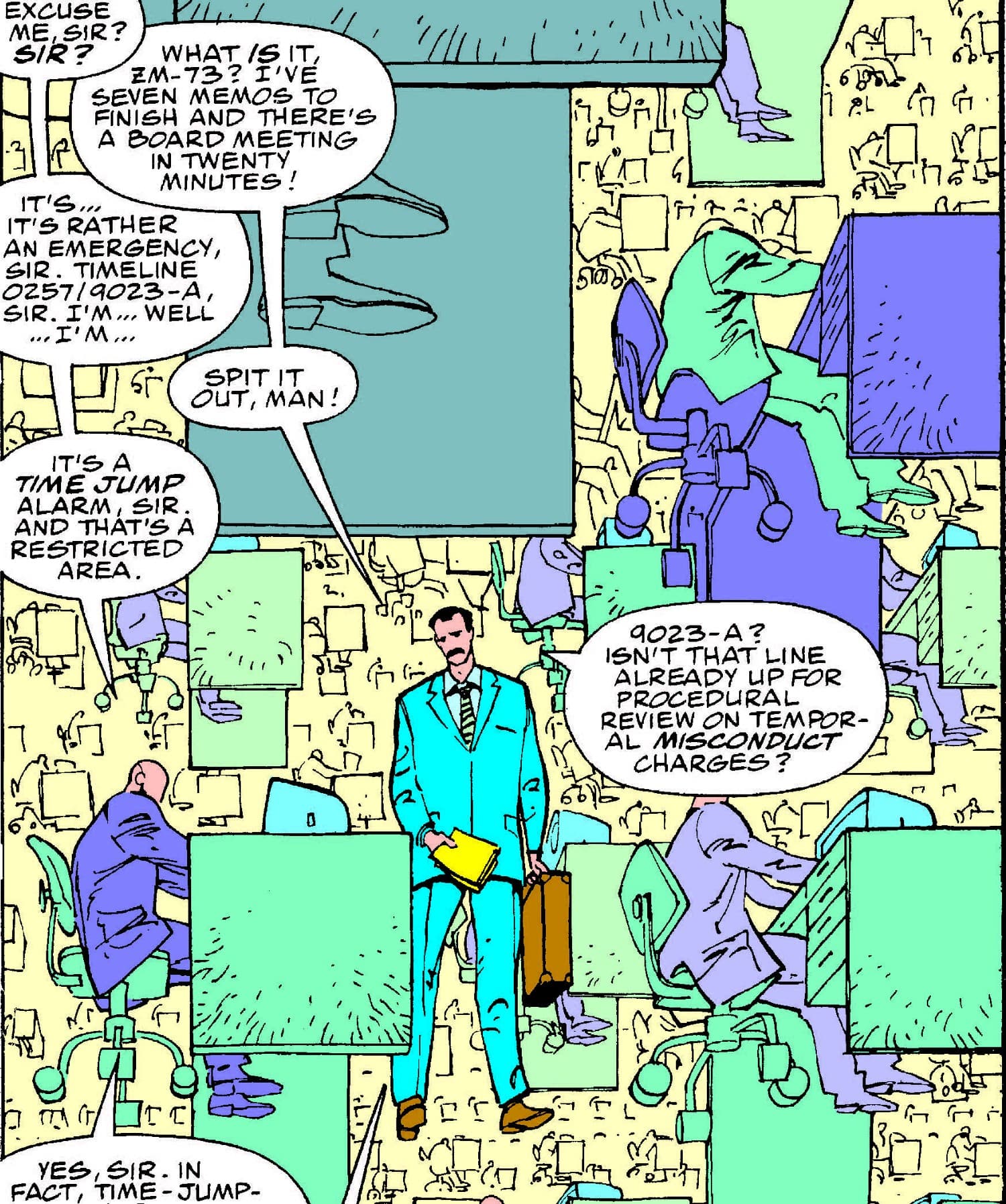
Additionally, lettering is what draws a reader's eye across the page, so layout is a major component of the art. As such, the letterer cannot simply drop the dialogue onto the page wherever it might conveniently fit. To guide the reader, letterers often use "the Z pattern," which cascades down a panel from left to right – a method so familiar that, if broken, it can cause confusion. "It’s a carefully choreographed dance between the art, the text, and the reader," Eliopoulos wrote. "And when one of those things breaks down, the story falls apart."
While lettering requires precise placement and thoughtful choices, there's still plenty of room for creativity, especially when it comes to sound effects. "Sound effects are a part of the process that has still remained pretty creative in lettering," Eliopoulos shared. "It's the one place where you get to make up your own rules." That is, a letterer's use of onomatopoeia doesn't have to be exact (how would you quantify the sound of Thor's hammer Mjolnir?), so long as it conveys the sensation of hearing a certain sound.
And now that you've got the basics, let's get specific! Read on to learn a few letterer terms and see examples of them, courtesy of gestalten's Marvel by Design.
LETTERER LINGO 101
Crossbar I: The use of a serif indicates the use of the personal pronoun.
Decorative Caps: Decorative caps are used to indicate a new section or major shift in narrative. They can appear as colored, bolded, drop cap, or in a different font.
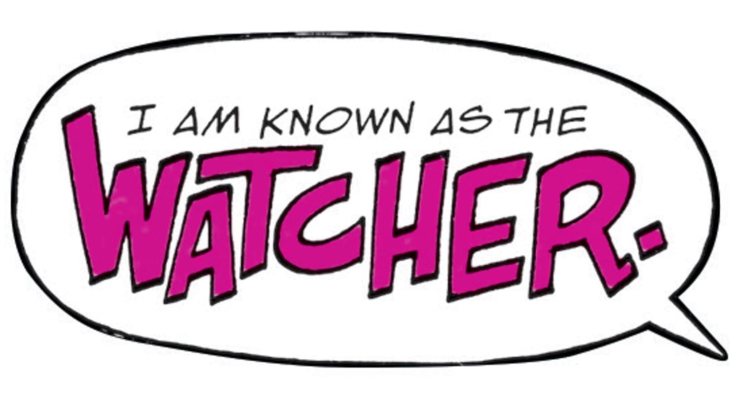
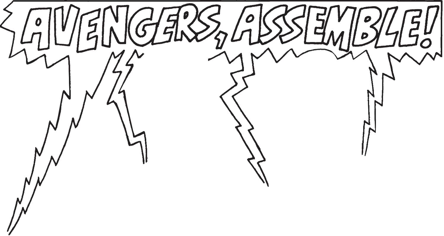
Display Lettering: Display lettering is stylistically distinct from word balloon and caption text. It includes logo text, as well as the lettering used for sound effects and signage within a page’s art.
Bold/Italic: Slanted, bolded text adds emphasis to a word or phrase. Letterers also use italic and bold type to break up a long piece of text and guide the eye through the page.
Capital Letters: Comics initially adopted an all-caps lettering style because it was faster for letterers, who worked by hand, to create straight, evenly spaced lines of text with only capital letters. Many letterers did so with the help of an Ames Lettering Guide, an analog drafting tool that creates a placement template for letterers to follow. As an added bonus, uppercase letters require less room on the page, resulting in tighter word balloons and more room for art.
Mixed Case: For a brief period in Marvel’s history, the company experimented with sentence-case typography. Under the direction of former Marvel president Bill Jemas, letterers used lowercase fonts, which were seen as more sophisticated but required additional room for ascenders and descenders.
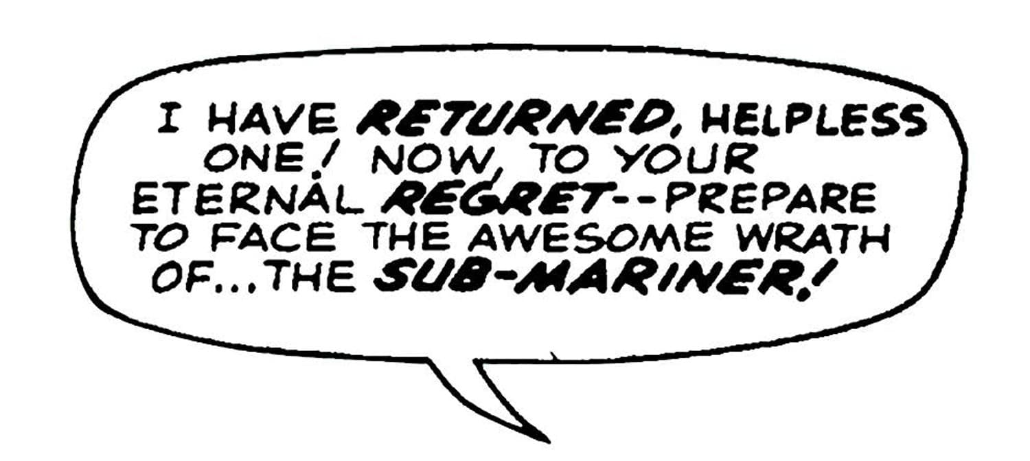
Word Balloon: A word balloon is an elliptically shaped balloon that frames dialogue text. It’s often positioned near the head of the person speaking, taking care not to obscure important information conveyed by the artwork. Word balloons can use different border styles to indicate nonverbal communication and emotion.
Open: Open word balloons that extend to the gutter are used to add space to a crowded panel. Letterer Bill Oakley used the technique to create a sense of flow and direction in Walter Simonson’s artwork for FANTASTIC FOUR (1961) #352.
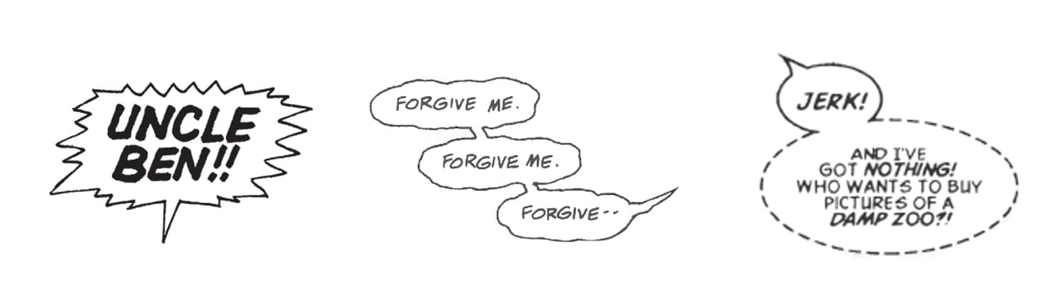
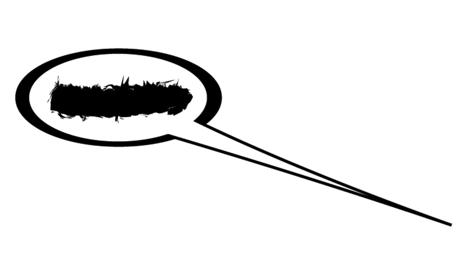
Bursts: Jagged edges on a word balloon indicate yelling, screaming, or generally loud speech.
Deflated: A wavy outline can communicate weak speech.
Whisper: A dashed outline indicates quiet speech. Small text inside a big balloon or a gray border can also represent whispering.
Broadcast: Sometimes called radio balloons, these craggy-lined balloons are designed to give the impression that speech is coming from an electronic device such as a radio, television, or walkie-talkie.
Air: The space between the edges of a word balloon and the interior text is called air. Letterers aim to keep the air tight as a way to preserve space for the artwork.
Balloon tail: The piece of a balloon that stretches toward the speaker’s mouth is called a tail or pointer.
Join: A connection between multiple word balloons is used when speech requires more space or is expressing two connected thoughts.
Thought Balloons: Also known as thought bubbles, these puffy balloons sit above a character’s head and are used to express a character’s inner thoughts. They were once common but are rarely used in contemporary comics. Today, captions are often used in their place.
Captions: A caption is text inside a box that is visually separate from the rest of the panel. Captions are used to provide information that art and dialogue can’t express. This includes exposition, third-person narration, and a character’s personal thoughts.
First-Person Narration: In the early days of comics, first-person narration often occurred in thought balloons that hovered above a character’s head. Contemporary letterers now express inner monologues through visually distinct captions. These can include boxes outlined in color, drop shadow or colored boxes, and italic text.
Emanata: Coined by artist Mort Walker, the term emanata refers to descriptive pictograms that hover near a character and express something about their current emotional state. Emanata can also communicate warmth when radiating from an object such as a cup or food.
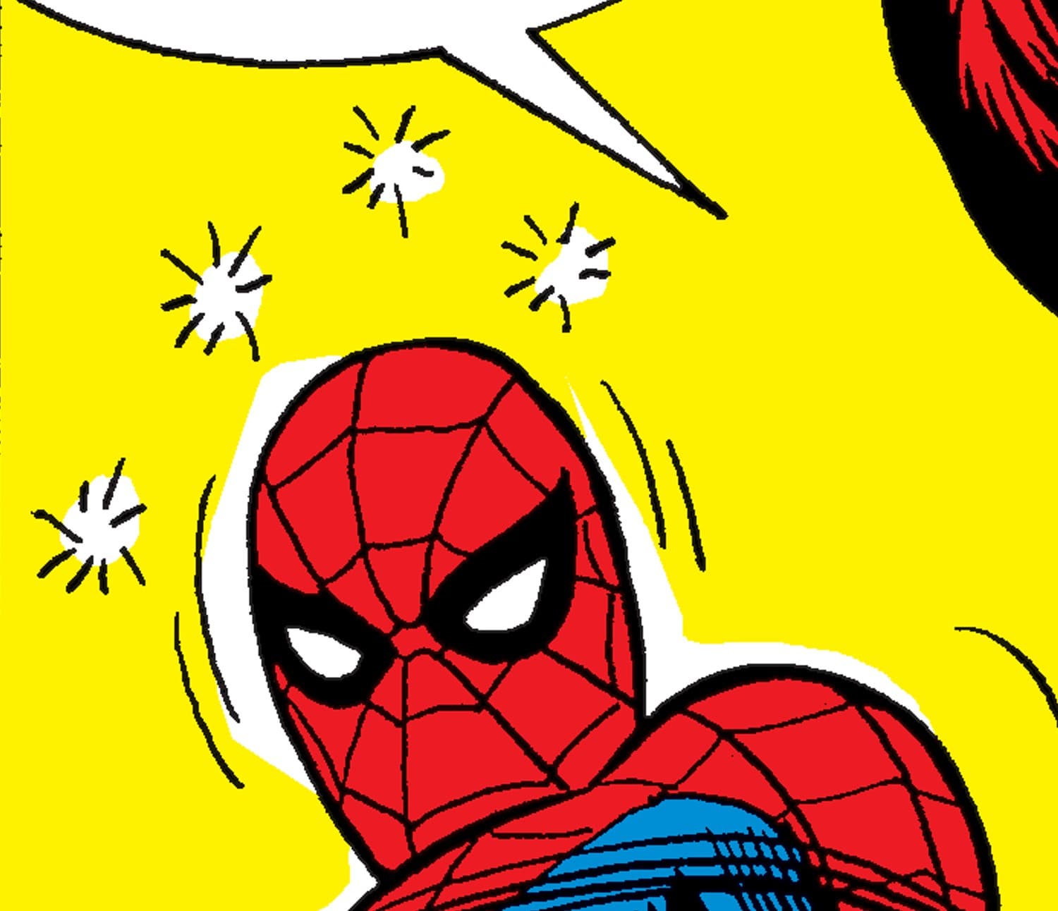
Speedlines: The lines that emanate from a character communicate rapid movement.
Asterisks: An asterisk indicates that more information can be found elsewhere in the book, typically in a caption or different issue of the comic.
Double Dash: Two single dashes indicate an interruption to a character’s speech.
Grawlixes: Randomly mixed letters, symbols, and scrawls replace obscenities in a word balloon.
Ellipses: Three dots at the end of a sentence communicate an unfinished thought.
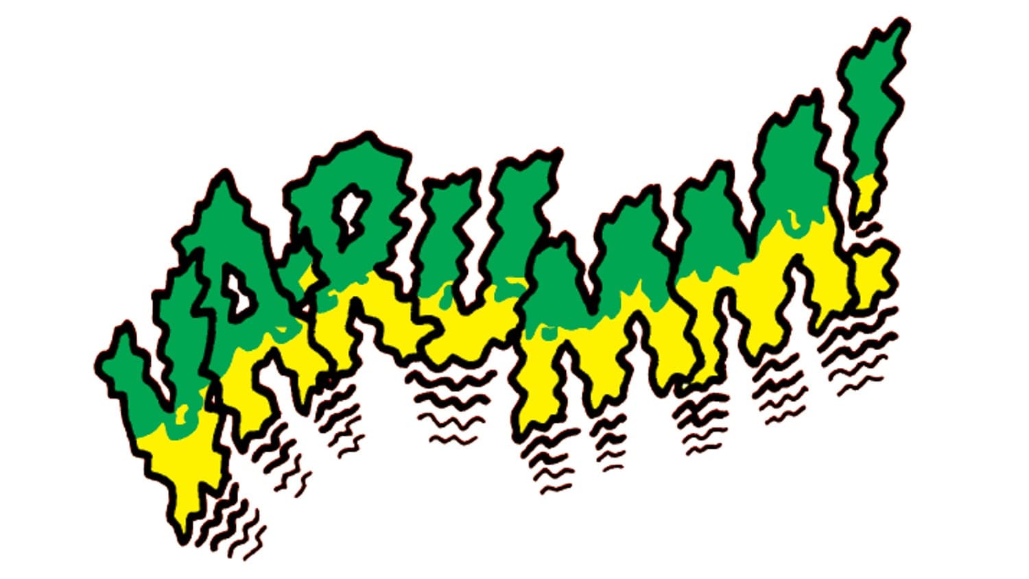
Onomatopoeia: A word that represents a sound. Also called sound effects, these words use expressive lettering styles to convey a sense of action that the reader feels more than reads. Lettering artists used to draw onomatopoeia by hand; today, they are fonts that each have a specific use-case.
Uppercase Balloon Font: Most Marvel comic books use all-uppercase text for word balloons and captions. VCJustinSays is designed to resemble Eliopoulos’s hand-lettering style, with thick horizontal and thin vertical strokes that he achieved by shaving a Hunt 107 pen into a wedge shape. The digital version, used across Marvel titles including AMAZING SPIDER-MAN, is evened out and standardized so it reads with clarity and lightness.
Character Font: Used for many of Marvel’s evil characters, VCDarth was designed with jagged, uneven strokes to indicate instability and malevolence. For the character Venom, Eliopoulos uses the font in white text on a black, crumbly word balloon.
Display Font: VCAngle is a display font used for titles, credits, and location captions. Angles replace straight lines, giving the font a classic look with an expressive twist. It has been used throughout many Marvel comic books.
Sound Effect Font: VCCartoonStew, Marvel’s default sound effect font, is based on simple hand-lettered sound effects. Its thick stroke has a slight bounce and is meant to grab attention but not demand it. The font has been used on hundreds, if not thousands, of Marvel comic books.
OUR LETTERERS
Marvel works with an array of mighty letterers, who juggle multiple books in order to bring you the stories you know and love. Over the course of the month, we spotlighted the members of Eliopoulos' VC Studios. You can learn more about them and the way they letter your comics by clicking on the names below!
Meet the Letterers: Chris Eliopoulos | Ariana Maher | Clayton Cowles | Cory Petit | Joe Caramagna | Joe Sabino | Travis Lanham
While you're at it, don't miss our list of Memorable Moments in Marvel Lettering or trailblazing letterer Janice Chiang's guest spot on Marvel's Voices. You can read a recap of the episode right here!
Marvel wishes all our letterers a very happy Letterer Appreciation Day! Thank you for all you do!
Interested to read more about "The Quiet Art of Lettering," as well as other Marvel design work? Don't miss gestalten's Marvel by Design, on sale now!
You can grab these comics and more digitally or at your favorite local comic book shop. Be sure to ask your local shop about their current business policies to observe social distancing or other services they may offer, including holding or creating pull lists, curbside pick-ups, special deliveries, and other options to accommodate. Find and support your local comic book shop at ComicShopLocator.com or by visiting Marvel.com/LoveComicShops.
For digital comics, all purchases in the Marvel Comics app can be read on iPhone®, iPad® and select Android™ devices! Our smart-paneling feature provides an intuitive reader experience, ideal for all types of mobile device and tablet users! Download the app on iOS and Android now!
The Daily Bugle
Can’t-miss news and updates from across the Marvel Universe!